Common DIY Website Mistakes to Avoid

16 Common DIY Website Mistakes to avoid Today almost anybody can build a website. You don’t need to know how to code, have years of experience and education. It’s possible to learn everything on the internet, if you have time to do that of course and if it’s your priority. You can even choose any CMS and use pre-made templates, customize them and you’re ready to go. As simple as it might sound, I crossed so many horribly-looking DIY websites that don’t have any strategy behind them and are visually painful to look at. This proves that it’s not enough just to drag and drop some random elements in the website builder, choose random stock photos, random colours, and fonts and hope that your website will do its job. You still need to have at least some basic knowledge of website design, tech, copywriting, strategy, and branding, and understand the goal of your website and business in order to build a strategic, aesthetically pleasing and well-performing website. A website is a tool, it’s not created just to say that you have a website. It should have a goal, every element should be well thought out and be there for a reason, not just to fill the space. I don’t want to speak in this blog post excessively about the design aspect of the website, as your website is so much more than just the design. You can have a very simple design, but the messaging, branding and strategy behind should be powerful, well-thought, and serve your business needs. Unclear messaging Even if you know nothing about branding I would recommend spending some time figuring out your branding message, creating your website copy, defining your ideal client, and your offer, finding your voice, and uncovering all layers of your personality. When you’re not clear, when you put some random words on your website to fill in the empty space, it will be hard for your website to attract, keep and convert your website visitors. Yes, it’s preparation work, not always an easy job, it can take time, but it’s absolutely essential. Can you imagine the hours and days you can save when you have everything prepared beforehand? You will just focus on the design and building pages without spending hours thinking about what to put on every single page. You don’t need to write walls of text, your copy and messaging should be clear and concise and speak directly to your target audience. The brand statement is the most important element of your home page – it’s your hook, the first sentence your website visitors will read when they land on your homepage. You will probably spend a lot of time crafting and perfecting it, and it’s okay. It takes time, doing the work, and discovering yourself to create a great brand statement. You can use the first draft of it and improve it with time. With time you will need to build a strong personal brand. Focus too much on colours, pictures, and fonts instead of focusing on the actual content Website design is important, it’s the first thing you see when you land on any website. So you might think that spending weeks choosing and changing your colours and fonts is the most important thing you should be doing when you create your website. Although, it’s not the visual aesthetics of the website that will bring you conversions and results. It’s the website’s content and the website copy. Choosing the visual style is one of the last steps in creating your personal brand and your website. When you do preparation, planning and self-discovery work first, the chances that you will stick to your brand visual style are so much higher. Here are some questions you can ask yourself before you start creating your website: What the goal of your website will be? What will you write on every single page? How many pages your website will have? What aim and CTA (call to action) for every page will be? What results you would like the website to generate for your business? No favicon icon A favicon is a tiny icon that shows up on the tab for each website in your browser, next to the page’s title. Many small businesses use website builders and it’s not a secrete. But please, make sure you create and replace a default favicon icon with your branded icon, but do not just leave a Wix, WordPress or Squarespace icon. It looks unprofessional and kills trust among your audience. The optimal favicon size is 16×16, 32×32, to 48×48 depending on the screen’s resolution. Make sure that it’s visible. Usually, square icons are the most visible. But feel free to experiment and see what you like that work for you. Here is an example of what a favicon might look like in a browser tab. The first icon is a customized branded icon I created for my website, and the second one is a WordPress default one, which looks not good at all: Use pre-made templates without any changes Most CMS (content management systems) have a lot of pre-made and ready-to-use templates. There is a huge temptation to copy them blindly, and use them to build an entire website. But the problem with coping website templates is that they will probably be used by many other business owners, and they are not adapted to your unique business goals and you. I get you, when you start you probably have a limited budget. If your business doesn’t generate any income yet, you’re unlikely to spend thousands of dollars on building your website. And to be honest it’s a bad idea anyway. You can use pre-made templates to guide you, inspire you, to help you, instead of copying every bit of it. You can try to customize them at least a little bit. It will let you have a more unique website that suits you, your branding, and your business goals. Another technique you can try
Complete Rebrand and Website Redesign of New Business
Compete Website Redesign & Rebranding for my new website design business How Everything started Before I even started my first business as a French language mentor, I was working different “normal jobs”. Back then I knew nothing about online business, website design or branding. My whole life I have been listening to others about what is ” the right thing to do”, and what ”the successful career path” should look like. I subconsciously gave the power to others and let them choose what I should be doing in this life. Then I wondered why I felt unhappy and dead inside when I was working jobs I chose accordingly to somebody else’s standards. But I guess that I wasn’t conscious enough of everything that was happening around me back then. My limiting beliefs held me back a lot and didn’t let me see the perspectives of what is possible. I had an inner feeling that I want more freedom, more creativity, more flexibility and enjoying more my everyday life, instead of waiting for weekends and vacations to live. I felt like something was lacking, but I couldn’t articulate what exactly just yet. I felt like there were something more to life than just spending 8h per day in the office with people I didn’t even like that much. By the way, I’m totally okay with people who love working in the corporate environment and who want security, it’s just not for me and has never been. I guess I let my intuition guide me and that’s how I started to discover some self-development staff. I was devouring self-development books, podcasts, and videos. I become kind of obsessed with all this. I started to realize that choosing a meaningful career path is one of the most important things that I can do for myself now. It’s not possible to think about higher staff, when the basic needs are not met and when you’re unsatisfied with what you do 8h per day, every single day. Language Mentoring I started to consider all possible options of what I could do as a potential job or business. I have several degrees in teaching foreign languages and I have already done it in the past, so the option to start a foreign language teaching business came to me naturally. I made a lot of research, and bought a lot of courses and books to help me to start, cause I had no idea what I was doing back then. Everything was new and hard. I didn’t know how to deal with my emotions, fears and insecurities that didn’t let me move forward. I put too much pressure on myself and compared myself to others who were in business for years. There was so much noise around me and listened to it, instead of watching inside and finding all the answers. So if you feel the same, don’t feel guilty cut out the noise, meditate, and stop following people who make you feel miserable. Keep asking hard questions, even if you don’t have answers yet. Believe that you will be able to figure everything out on your way. The path can only be made by walking. Being trapped in your head and overthinking everything will keep you in the same place you were a year before. Ask yourself what you can do NOW so that you could become the person you would like to be in one year. Everything we have is the present moment, and the things you do now at this moment will determine where you will be in several years. In the beginning, I was left alone trying to figure out everything by myself: marketing, website design, searching for clients, mindset, and the process of working with clients. I was doing busy and trivial work because I was too afraid to do the “scary part”. I was afraid to reach out to people first, I was afraid to have real conversations, and be rejected, and I was afraid to put myself out there. So as you might guess it was hard to get new clients, and it was hard to work and serve my clients best. I was always worried about what I will do next, and couldn’t be in the present moment, doing my work the best. Work with a Branding Coach One day when I was having really hard times emotionally because I desperately wanted to make everything work, I found a personal branding coach to help me. It was a bit too pricey, to be honest, but I still decided to go for it. During our work together I learned a lot. I had my branding and website as a French language mentor ready when we finished working together. Although, I didn’t have more courage, readiness, or more willingness to show up online. I was worried as before about people judging me. Doing the work every day felt like drudgery. I felt so much resistance inside, I didn’t enjoy what I was doing. When you do your work with this kind of energy of constant fear, lack and resistance, it’s not possible to be creative, not possible to serve your clients best, and not possible to attract new ones. That’s when I started to ask myself hard questions if I really would like to continue teaching. I started to dig deeper and deeper inside myself even more. The work that I did before wasn’t deep enough, it was kind of on the surface. There was no clarity about me as a person. I didn’t know what I was standing for, or what my values were. I didn’t ask what I really won’t be doing, what brings me joy. It is exactly when I discovered “an ultimate life purpose course”. It was very affordable and packed with value ( which is proof once again that you don’t need to invest thousands of dollars in the beginning when you don’t have it). I started to rediscover myself, read good books, do a lot
How to Create a Perfect About Me Page for Your Small Business + Template

how to create a perfect about me page for your small business + template The about me page is one of the most overlooked pages of a website, however, it’s second the most visited page of any website after your Homepage. When you just starting out, probably creating an About Me page won’t be your priority. You will more likely focus on your home page, service and contact page. And you don’t need to have everything ready, all pages have been perfectly done before you launch your business. You can always add more pages with time. Usually, we keep putting away creating our about page, as we don’t like to speak about ourselves, and sound egocentric ( well, maybe some people do like it, but not everybody). But your about page isn’t about you, and never actually was. It should be mostly about your ideal client. Your about page isn’t there to talk about your passion, to present every single date of your biography and your background, or show people all your diplomas, and awards you have. The purpose of your about page is to reassure potential clients that you’re the right choice, that you’re an expert and that you can be trusted. There are several reasons why your website visitors might want to find an about me page on your small business website. Why do people click on the about me page When your website visitors click on your about page usually they would like: They would like to find out if this business, brand or person is legit. Does this person have experience and any background in what she does? Did she work with recognized people or brands in the industry? Does she have the expertise and skills to complete the project I will hire her to do? Are any unbiased case studies, or testimonials that can prove it? They don’t quite yet understand what your brand and business are all about and they would like to know more. If it’s a case it means you somehow failed to communicate in a clear way what you, your brand and your business are all about on your home page. If this is the case, it might be a good idea to improve your home page. They would like to know if they resonate with this brand or business, with its mission, values, purpose, and why. Does this person care about the things I care about? Do we have similar values? Do her purpose and mission excite me? Why do most about me pages fail? Your copy is too self-centred. People are interested mostly in themselves and in solving their problems, they don’t want to spend a lot of time reading about you and your achievements. They only care about what is there for them and what you can do for them to make their lives easier or solve their problems. If you’re not quite sure how you can improve your copy, a very simple tip is to stop using pronouns like WE, and I and shift your focus to the person who is reading your copy by addressing them and using pronouns like YOU/YOUR. There is a simple technique to find these pronounced on your website copy so that you could change them after. Click Ctrl+F and type the world you would like to find. Here is an example of a very nad self-centred copy example: You don’t have photos of real people and use stock photos instead. Usually, it’s quite obvious when you use stock photos of smiling people, you don’t know on your website. People ignore stock photos, they don’t add anything useful to your website but just take space. Using photos you took, and photos of you and your team it’s your possibility to connect with your website visitors, to tell a story, to let them find out more about you and show your personality, and make them trust you. Mind your tone of voice and the vocabulary you use in your copy. Don’t just write generic stuff that you think your prospects might want to read. Don’t use smart words that add zero value to your website visitors. Don’t try to appeal and speak to everybody. Appealing to everybody means appealing to nobody. Instead infuse your personality into your copy, express your opinion, and share your experience. Use simple and understandable vocabulary to describe your client’s problems, and current situation, and describe how you can help them. Show them that you understand them and genuinely care. No social and credibility proof. It’s important to include social proof on your about page the same way you would do on any other page. Let other people, your former clients, and your case study tell and show how great you are, instead of singing odes about yourself by yourself. Mind simple design principles. I will not be talking here about the aesthetic aspect of design, but mostly about the user experience aspect. When things are hard to understand, hard to find, or hard to read, when something annoys people, they will leave your website, and most likely won’t come back. Here are several things that ruin your website’s user experience a lot: Walls of text and insufficient use of white space Busy and cluttered interfaces Poor choice of font size, colour, and contrast, which makes text very hard to read. Aggressive sales tactics, annoying pop-ups, and banners that are appearing and moving by themselves. No call to action. Just like every page on your website, your About page should conclude with a call to action (CTA). Don’t leave your website visitors guessing what they need to do after they finish reading your page. Guide them, and invite them to take action. It can be something like booking a call, contacting me, joining my email list, checking my blog post and do on. A template of the about me page that you can use to build a great about page Final thoughts In a world of too much
WordPress VS Squarespace Which is Better or Your Small Business Website?

WordPress VS Squarespace which is better for your small business website? Today almost anybody can build their website by themselves. You don’t need to spend thousands of dollars and hire a professional developer to do that. It was hard to imagine several years ago, but today it’s a reality. You can find almost any information you need on the internet, and watch endless tutorials to help you to set everything up and run your business. When I started my business I didn’t have a huge budget to hire a professional to build a website for me, so I decided to set everything up by myself. I spend a lot of time researching all possible CMS (content management systems), domain name providers, and email marketing software so that I could choose the best and the most affordable ones. Because back then I didn’t have clients yet, so I couldn’t afford to invest in expensive software. You can also start simple and you can always update your tools as your business grows. There are many advantages are building your website on a website builder, rather than building everything from scratch by a professional developer and web designer. Well, you can do that if your company can afford to pay thousands of dollars to do that. There are endless options available and the most popular CMS are WordPress, Squarespace, Shopify, Wix, Kijabi, Wix, Showit, Webflow and many others. In this blog post, I will compare Squarespace and WordPress. I will probably do blog posts comparing other CMS in the future. Advantages of website builders There are many advantages of using a website builder to build a website for your small business: Most website builders are much more affordable than building everything from scratch by a web developer Content management systems give you the possibility to update your content, rebrand your website, to add products, if you have an e-commerce website, whenever you want. You have so much freedom, and don’t need to wait and pay somebody else to do that. You can make your website look professional even if you’re not a professional web designer If you have a blog, you can download blog posts by yourself, update them, and add graphics. If there are any issues, they are often handled by your hosting provider or by the support team of your content management system. You don’t need to spend endless hours learning how to code and figure complicated tech stuff out by yourself. All the updates are automatic and you don’t need to worry about that Most CMS are SEO friendly. Things to consider before you choose cms There are so many website builders available these days and it’s very easy to get lost especially when you just getting started. The most important things you might want to check are: The price. Are there any hidden costs? Is it user-friendly? Or will you need to spend several months and try to figure everything out? Is it customizable enough? Will you be able to make everything look exactly as you want? Are there quality templates, themes, and design effects? Does it have the functionalities your business need for example a blog, e-commerce, forms, booking calendars, membership area and so on Will it be possible to migrate your website to another platform if you decide to change it? Does it have SEO-friendly URLs? Is it easy to create a mobile responsive website? WordPress WordPress is an open-source free content management system that was released in 2003. Open source means that the code behind the system is available and can be easily modified. Over 30% of the world’s websites are built with the help of WordPress. Pros: Very customizable. You can customize every single part of your website and make it look exactly how you want Tens of thousands of free themes and plugins, premade design templates WordPress is free. The only thing you need to pay is hosting and your domain name You can have a blog, an e-commerce website, a membership website, and sell courses. Everything is in one place. You can easily integrate third-party tools like email marketing software, SEO tools, and lead generation tools. There are many great options for a drag-and-drop builder, which make building a website very easy for newbies. There are many good plugins to translate your website into many different languages You can easily migrate your website and all the content on your website elsewhere if you decide so Cons: A learning curve, but the most user can adapt very fast Security, SSL certificate, updates, and backups are your responsibility, but good hosting providers such as Bluehost can help you to manage all that You’re responsible for upgrading your website hosting plan Squarespace Squarespace is an all-in-one content management system or CMS. With a single subscription, you can create a website, host your content, register your own custom domain name, sell products, track your site’s analytics, create your blog and so much more. Pros: As it’s a closed system and it’s very easy to use for beginners Looks very beautiful and creates a great user experience Gives you the possibility to build simple and beautiful websites without hustling and worrying, even if you’re not a professional web designer Cons: It’s very limited in terms of customization and has limited amounts of templates. It means that you can find many websites on the internet that will look exactly like yours. The basic price starts at 12$ per month for a personal website and 18$ for a business website. Which will cost 216$ per year. It’s twice more expensive as basic hosting for a WordPress website, especially for a small business owner who just starts out. The number of pre-made templates, designs and customizing options is very limited. Themes come with a limited number of layout choices. You can still do basic colours, fonts, website logos, and other things, but these templates are not as customizable as WordPress themes. The choice of official third-party integrations is quite small
How to Use Popups on Your Website Effectively
How to use popups on your website effectively Pop-ups can be a helpful tool that you can use on your website, but only if you use them in the right way. Because in most cases website visitors simply ignore them or even get very annoyed. I am personally, not a huge fan of pop-ups. I don’t like to use them on my website and the websites of my clients. When I visit other people’s websites and have a popup right away before I even interacted with the content, it creates a horrible user experience and I want to leave the website right away. But It shouldn’t be used this way, there are some other ways of using popups that don’t ruin the user experience and make your visitors take actions you want them to take. According to many recent studies most people hate popups. They come to websites to complete a particular task or find a particular piece of information. And when their attempts to do so are interrupted with popups all the time, they start to feel very frustrated, they cannot complete their task and leave the website with a very bad impression of the website. And if they leave feeling this way, most likely they won’t come back to your website. So what is a popup? A popup is a window or a dialogue that appears on you at the top of the page content. Although, popups can remain useful design tactics, but only if you use them properly. Let your visitors interact with your content first One of the biggest mistake website designers and business owners make today is bombarding a new visitor with popups before even the main page loads. New visitors don’t know you or what you do, they want to complete a task or find a specific piece of information when they land on your website. And you prevent them from doing it by showing popups right away. Most of the web users these days are getting used to seeing premature popups all over the web, and the only response that they have to it is to ignore it right away or even get irritated sometimes. Premature popups make your website look desperate and create a very bad user experience from the first seconds of being on your website. I’m sure that you would agree that it’s not a long-lasting strategy that will help you to attract your ideal client and build an authentic community. What you can do instead: If you want to have popups on your home page, if it’s something that helps you to have more people sign up to your email list, you can leave it there. But make sure that you leave enough time for your website visitors to interact with your content, to find what they are looking for. Give your website visitors value before you ask for anything from them. New website visitors will trust you more and will be more willing to give you what you ask for. Ask for emails before visitors interact with your content This problem is similar to the first one. It’s when you ask for people’s email right away when they land on your website before they even find out who you are and what you are doing. Although, by choosing to do so, you do a favour nor for you neither your potential clients. People will be annoyed that you ask for their email too soon, that the timing for asking isn’t appropriate. Moreover, they will consider that there will be tons of spam and junk email sent to them if they give their email address too soon. What to do instead: You can still ask for people’s email on your website, although, the timing should be just right and with minimum intrusion. Don’t ask for too much information. Usually, just a first name and email are more than enough. Let your visitors get to know what you’re doing, your offer, maybe read a valuable blog post. And only after that, you can have a small form asking for their emails. You can explain what people will get by signing up for your newsletter. Or maybe offer some valuable piece of information in exchange for their emails. If you sell physical products, you can offer a promotional code in exchange for people’s email for example. Interrupt access to the content by popups Another bad thing to do is to interrupt your visitors with overlay popups when they’re engaging with your blog post or another valuable piece of information. It looks like you’re conditioning access to your content. It kills credibility and trust among your visitors. What to do instead: Allow your website visitors to do the main task they come to your website to do – to consume your valuable piece of content without interrupting them. Instead, you can create a small banner on the top of your website or a form at the end of the article to ask for their email. Showing multiple popups one after another Showing multiple popups one after another can overwhelm your readers if they need to close one pop up after another. It takes too much effort. It makes your website look unprofessional and very desperate. What to do instead: Avoid displacing several popups in a row one after another. It’s never a good thing to do. Don’t put any vital information in the popups as people tend to close them without reading. Instead, you can put ab important piece of the information directly on the web page where people can see it. Make sure that popups can be easily closed If you d decide to use popups on multiple pages of your website, make sure that your visitors can easily close them and continue with their task on your website. It can be very annoying when people cannot find the way the popup easily. It frustrates them, makes them lose their time, prevents them from finding valuable information on your website. What
How to Design a Perfect Cover for Your Home Page
How to design a perfect cover for your home page It can be a nightmare sometimes to create and design a proper cover for the home page of your website. It’s always very difficult to choose the design, especially when you’re not a professional web or graphic designer. But you still want your website to look beautiful and be cohesive. In addition to beautiful design, your home page cover should be strategic, and clear, and fulfill a very specific goal. I struggled with creating a good cover for my home page for a very long time. I searched for inspiration but still couldn’t figure out what kind of design I would like to use and what will work the best for my business. In the very beginning, as I knew nothing about web design, my first website looked very chaotic and was not intentional. What roles should a cover of your home page play? Creating an aesthetically pleasing design is important, but the most important role of your website isn’t being beautiful. The main role of your website is to attract the right people, build connections, and make your prospects take action when they land on your website. Your cover, as any other section on your website pages, should play several very important roles. The cover of your home page is the first thing your prospects see when they land on your website! You don’t want them to see a messy and huge chunk of text that is hard to read, stock photos of smiling people, and absence of calls to action. These are some of the best practices for the cover of your home page: Have a clear and visible navigation menu. Your logo should be placed on the top of the page. It’s where your prospects expect it to be. A high-quality photo of you. Please don’t use stock pictures of smiling people on your home page cover! People want to connect to REAL people. A clear statement of what you do and how you can help your prospects. Call to action. Clear and well-placed navigation menu People don’t have time, don’t make them think too hard and figure everything out when they land on your home page. Most likely if they cannot find what they’re looking for, they will just leave. Your navigation menu should be visible from every page of your website. Visitors should be able to navigate to the most important pages easily and without clicking 10 times and search how they can do that. People lose attention on the web very quickly. Don’t place your navigation menu in a weird, unexpected place or make it look like not a navigation menu or what’s even worse hide it. The best is to have the navigation bar when your visitors expect it to be – on the top of your website. As long as it’s on the top and visible, you can place it more to the left or more in the middle. It’s up to you to choose. Make sure your Logo is visible and well-placed Make sure that your logo is visible no matter on what page your visitors land. It can help to build some brand awareness. Don’t place your logo in weird and unexpected places as well. Make everything easier for your visitors and put it where they expect to find it. The best practice is to have it in your navigation bar either on the left or in the middle. High-quality photos of you This one is huge! Make sure that you have beautiful, high-quality photos of yourself to put on your website. Don’t use excuses, hide, and put some random stock photos of smiling people all over your website. People want to see REAL people behind their brand and business. The era of the faceless corporation is in the past. Even a lot of very giant corporations start to invite and use real people to seem more human. There were many studies conducted on how users treat images on the web. Stock, generic photos in most of the cases are ignored completely by visitors. But photos of real people is treated as a valuable piece of the content. If you do still not have doubts and don’t want to use photos of yourself, check this study concerning photos as web content published on one of the world biggest websites dedicated to user experience on the web. Don’t worry if you cannot afford a photographer, you can always make great and high-quality photos for your website by yourself. A clear statement of what you do and how you can help This section is as important as high-quality pictures of you. When your prospects land on your home page, they’re looking for a particular solution for their problem, and they want to know right away whether you’re the right fit for them. When it’s not clear from first sight what you do and how you can help, most likely your new visitors will leave. You can make a quick test by yourself. Ask people to go to your home page, and see if in 3 to 5 seconds they can say what your business is about, and how you can help make their life better or solve a particular problem. If they need more than 5 seconds to tell that, most likely you need to make some improvements. If you have no idea where to start, there’s a very simple formula you can use to help you: (What I am). I (do what) (for whom) (with what benefit). It shouldn’t be the exact formula, but it’s just to give you an idea. Call to action Your website should have a nice and consistent design, but most importantly it should make people take action. You don’t want your visitors to browse your website and leave. Often, people even want to take action, want to be told where to go next and what to do, but they can’t do that, because there are
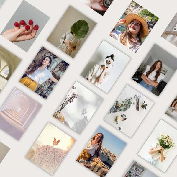
How to Make a Photoshoot for Your Website by Yourself
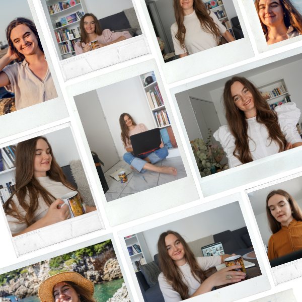
how to make a photoshoot for your website by yourself Professional photos of you are so important for your business, social media, and your website. Although, it can become a real struggle for somebody who doesn’t have a budget to hire a professional photographer or even for somebody who doesn’t feel comfortable in front of the camera and other people. I used to struggle with it a lot when I started to build my first website. I used some old, bad-quality photos, or even worse I did everything possible to avoid showing my face. I found some random pictures of smiling people, books, landscapes and used these instead. It was a very very bad idea! As the result, the website looked generic, it didn’t show the person behind the business, didn’t create a connection with my website visitors. When I started to work with my first brand coach, it became obvious that I needed to start making changes, make my business and my website more personal, show my face, own it, and don’t hide! I still didn’t have a budget to hire a photographer, I’m quite an introverted person and don’t feel comfortable in front of a camera and people I don’t know either. So I started to brainstorm what I possibly could do to create great pictures for my website. I remembered that several months before I found a great person on the internet. She travelled a lot by herself and didn’t have anybody to take pictures of her, so she started to do it by herself. And invented this very cool concept called ”advanced selfie” The concept exploded and became very popular. What it means is artistic photos of yourself taken by yourself. It’s not very easy in the beginning, it takes some practice. But the more you do it, the better your photos will be. Equipment & Clothing The preparation stage is very important! It will save a lot of time and effort during the shooting day. So take some time to prepare your photoshoot properly, and you won’t regret it. Equipment Tripod Camera Phone with a remote control Charged batteries (have at least 2 or 3 properly charged batteries) Vertical L-Bracket for your camera, if you would like to take vertical photos. You can use your phone as well, but it will be w bit more difficult because you won’t see yourself Clothing Think over and choose all the possible outfits you would like to wear during the photoshoot day. Try them on, see what you like, and have them ready. Props Choose the props you want to use for making your photos. It can be anything: a laptop, flowers, cards, notebooks, books, a cup, and so on. Down below I found some examples of pictures when people use props. Get Inspired Inspiration is everything! When I started, I thought that I don’t need any inspiration and that I could invent everything by myself: poses, facial expressions, hands, and leg positions. I can say now, that it looked pretty bad. So many things have been already done before, invented, and tested by many talented people. Why not get inspired, check what other people do, and see what you like and what works the best for you. It will help you find what feels authentic to you, and how you feel like showing up. I use Pinterest for searching for inspiration. It’s a huge image search engine platform that can help you find any images you’re looking for. Create a mood board or a specific board for yourself and save all the images you like. You will have everything in one place, ready to use right away. You can also check YouTube tutorials, accounts and blogs of people you like or photographers to give you some ideas. Of course, you can use just Google or some other people’s websites if you prefer. Do what is easier for you. Possible Types of shots There are many different types of photos you can make for your website. It’s a good idea to vary photos so that they don’t look all the same all over your website. Some examples of images can be: Head Shots It can both headshots when you look directly at the camera, look away your profile 3/4 of your face Other Poses Full body poses Waist poses Knee up poses Basic photo principles Good Light Make sure that you’re very close to the natural source of light or that you have good artificial light. The photos will look so much better and will require less editing. Composition Make sure that you are in the middle of the photo or very close to the middle. This way the photo looks more balanced and more beautiful to look at. Be Yourself and Have Fun Just be yourself, do what feels like you, and have some fun. Don’t try to be somebody that you’re not. Enjoy the creative process! Editing and choosing the best photos You want to make sure that the size of your photos is adapted the best for every page of your website. Make sure that they’re cropped properly and have the same size all over your website. Check if they look good on both tablet and phone as well. You can always edit pictures a little bit too, to make them look even better. Everything is up to you. You don’t need to do anything complicated, just very simple and basic editing. You can find a lot of very simple tutorials on the internet on how to do that. My photos I will share my photos I made during different stages of my business. There will be photos of both when I started, and when I learnt a bit more about photography. Today I know that any time I need to update or change some photos on both my website or create more photos for my social media, I can easily do it by myself at home. And you will be able too!
5 Things You Need to Do Before Creating a Website

5 things to do before creating your website When you’re starting your business, it’s so tempting to start creating a website right away! Nothing complicated, just put several web pages together, propose my services, and make money. Actually, that’s what I did, when I started my first language mentoring business. I didn’t realize back then what exactly I want to offer, to whom, at what price, and how I want my design to look like. So as you can guess the website looked very messy and lacked clearness. Now I realize that there were easier ways to find clients and start making money right away. But I was resisting and didn’t search for clients until my website was built. Even after it was built, it didn’t bring me the results I wanted, surprise! Don’t get me wrong, the website is a very powerful tool that you should absolutely use for your business. It’s an online version of you 24/7. But often, when we especially build a website by ourselves, we search for perfection, we hide behind the research and don’t do the actual things that help us to get clients and get paid before our website is ready. I learned all these things the hard way. I wasted months doing research, learning about the tech staff, and trying to put everything together by myself. It was stressful, overwhelming, and created a lot of anxiety. Only when I did profound work on my brand foundation and me as a person, I was able to put a website that was clear and that was a total reflection of me and my business. Define who you are, how do you want to show up, what are your values and your strengths If you decide you create your business, probably you already know what you want to offer. Although, it’s so important to take your time to learn more about your values, strengths, and you as a person. What drives you? What keeps you awake at night? What is important to you and why? What are you really good at? You should always focus on your strengths. Although, I believe that in today’s world it’s possible to master any domain even if you have never worked in this field before. It’s very easy when you just start out to get intimidated by other people, who have been in the field for many years. It’s also very easy to start comparing yourself to others. But it leads to nowhere, you can lose your voice, and before even finding it, imitate what other ” successful” people are doing, even if it feels not like you. Be very careful when it happens. I personally had really hard times with all this, when I started. I saw all these “successful” entrepreneurs with beautiful websites, and strong personal brand, who were showing up consistently and so easily on social media. I was intimidated, created a lot of negative emotions with my thoughts, tried to please everybody, worried about what others will say, and had hardly anything done. So I would recommend sitting down and writing your why’s values, strengths, and things that will love to do and that will feel like authentic to you. When you have a strong inner foundation, you’re more likely to create extraordinary work and express your voice confidently. As soon as you’re clear about all this, it will be so much easier to write a copy for your website, choose or create images, step into your power and show up in the world as your authentic self. Define your business why and purpose This one is huge! Why did you decide to create your business in the first place? Why is it important for you? What problems do you want to solve? The strongest your personal whys, the easier it will be to keep going when it gets hard. Your whys prevent you from quitting. Very often your whys are basically your values. What do you value and why? It is freedom, community, honesty, creativity, learning, purpose, self-expression, and beauty? Or maybe something else? Think about it. In the same way, you need to define your business values. As soon as you are clear about your business’s values and purpose, it will be very easy to explain what you do. Being clear on the purpose of your business is vital. It will help you to write a web copy so much easier too. And what is even more essential, you will be able to attract the right people and make people who are not the right fit for you leave. Define who do you want to serve I didn’t realize the importance of this one for so long! I tried to serve everybody, please everybody which is basically equal serves nobody. I thought, well I need to offer many different services to all different kinds of people, and it will help me attract more clients. How wrong was I! People are tired of too generic products, and services that speak and serve anybody and nobody. Maybe it still worked in the middle of 20 century, but not today. I know that going narrow and being specific is scary, our lizard brand doesn’t want that. Because it means being more personal, more open, and more vulnerable, creating connections with people you want to serve, providing value, and making these people your fans who won’t help but buy from you. But only if you genuinely care and provide free value. 100 true fans and really specific people who LOVE and follow what you do can is so much more valuable and can bring more profit than 10000 people who don’t care or are not interested in what you do. Can you imagine how much easier it will be to write your sales pages, create products, and services, and create content and web copy for your website? You will have this one ideal person in your head and every time, you will know exactly what you
Make Your Website Look Professional Even if You are Not a Designer
Simple Design Principles that will make your website look professional even if you’re not a professional web designer Today there are many CMS (content management systems) like WordPress, Squarespace, Shopify, or Wix that make building a website for your business easier than ever before. You don’t need to know how to code or pay a fortune to a web developer. There’s still a learning curve even with these simple website-building platforms. But fortunately, you can find almost all you tutorials you need on the internet today. Another very cool thing about CMS is that it gives you the possibility to update your content every time you want to. You have a lot of control over your website. You don’t need to pay and hire a web developer every time you want to add new blog posts, add new products or change images on your website. You can choose a suitable CSM for your business according to your budget, your goals, and your specific needs. Everything sounds so easy, isn’t it? Just choose a platform and build an amazing website for your business. And you’re ready to go! Well, everything is a little bit more complicated than this. Even though installing everything is easy, you still need some knowledge about basic design principles, website strategy, and copywriting. When I started building my first website for my teaching business, I have no idea about all those things that I mentioned above. So you can guess that my first website turned out to be quite messy, and purposeless. When I rebuilt it the second time it was a completely different story. So I want to share with you some simple principles that helped me to build a professional website for my business. Consistent style The absence of consistent style through the website is probably the worst mistake you can make. It creates a lot of confusion among your prospects and often makes them leave your website. And let’s be honest, it looks armature and not professional. So what do I mean when I speak about the consistent style? First of all, it’s the consistent use of colours, fonts, style of buttons, graphic elements, and even spacing. If the buttons on your home page are orange and have a square form, make sure that it stays orange on every single page and doesn’t become green, blue, or round. Choose 2 to 3 font styles that you will use everywhere. In addition to your fonts, make sure that the main text, heading, and subheading font size, and that the distance between the lines is the same. Colour plays an important role in creating an aesthetic visual style and can evoke different emotions in your website visitors. I won’t go too deep into the colour theory here and the tools you can use to choose your brand colours. I wouldn’t recommend choosing more than 3 main colours for your brand, otherwise, it becomes too much. Even with 3 main colours, you will still use more, as you can create tints and shades of your main colours. Another very important element that creates consistency and a nice user experience for your future clients is spacing. Make sure that the spacing between different elements of your website pages is the same. For helping you be consistent and prevent you from searching all this information every time you work on your website, you can create your brand board or brand information. It’s a separate document that contains all your brand style information. You can share it with your team member as well if you work not alone. I prepared two visual examples so that you could see the difference between a web page with a consistent style and one without. Can you see the difference? Alignment The influence of both text alignment and the alignment of all elements on a website is often underestimated by many people. But it’s vital for creating harmony and overall aesthetics of any website. When you create a blog post or a section with text it should be concise, separated into paragraphs and bullet points. People don’t read on the web the same way they read printed materials. On the internet, they scan information. It’s better if your text is aligned from left to right, it makes reading easier. Make sure to have enough margins and white space, don’t crash the text with too little white space. The same story goes for aligning groups of different elements together. For example, if you put your heading in the middle, make sure to align the rest of the text and buttons, if there are any, to the middle as well. And to illustrate what I mean, see the images down below. Which section looks better? Which text IS MORE READABLE? White space & Proximity White space helps your website to breathe and look less cluttered. It contributed a lot to the overall harmony of any design. Mind the white space between the different element and their placement on a website page. Avoid placing elements very close to one another, or very close to the borders of the page. It makes some elements or text look crushed. Mind also a space between lines in your text. Space makes the text easier to read. Also, group elements that belong together. It will help to eliminate confusion among your prospects. Our brain treats information in a certain way. If you want to learn more about the law of proximity, and the way you should group elements on web pages, check this article. Can you see any difference? Does one form is better than another? Conclusition Good design doesn’t look this way accidentally. It’s a result of conscious decisions. When the design is good, usually we don’t notice. We just go through the website and enjoy our experience. It’s a good sign! But when we get confused by colours, and cannot find the information we need, we get frustrated and leave. There’s no magical formula that will create an ideal website for your
Portfolio: Branding My First Website as a Language Mentor
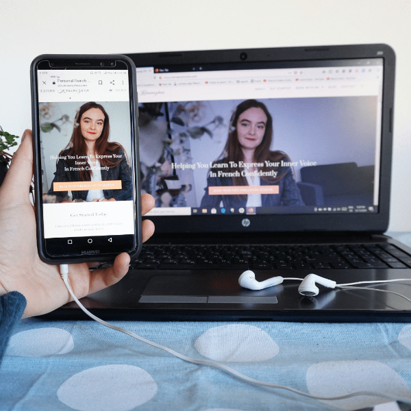
Process of Branding and building OF my first website as a language mentor When I decided to launch my first ever website as an independent language mentor, I knew absolutely nothing about branding, website design, copywriting and basic principles of UX design. My budget back then was very limited, so I decided to go with WordPress. It took me some time to figure out how WordPress works and what steps I need to take to build and publish my website. God bless the internet! It was hard to figure out the technical part of things and in addition to this, I had no idea about branding and what a professional website should look like. The old version of the website looked very messy, It had no goal and no structure. Even though I was not a professional designer, I had a feeling that there were many problems with the website: the style, colours, fonts and spacing were not consistent, the website copy was not clear, and there wasn’t a clear goal of what I wanted my website to do for me. After some time, I realized that I could have done everything much faster and so much better if I did the preparation work beforehand and taken my time to learn some branding and web design basics. PREPARATION STAGE The first step should always be researching. You should look for the websites you like. What do you like about them and why? Do you like the layout? The elements? Colours? Fonts? Analyze it properly. Verify all the successful websites in your niche. I investigated properly how these websites look like, doing and how their websites look like. It helped me understand the strategy behind the website and its goal. I analyze the web copy, branding (if there’s any), layout, and user experience. In today’s world having just beautiful and aesthetically appealing design isn’t enough. Everything started with building the foundation of my business and my brand. Visual rebranding and a beautiful website followed as a part of my brand. Later, I built my brand board to help me to stay consistent while building my website. My brand boards included fonts, colour palette, main logo, elements and pictures. Your brand board is like a manual for your designer. Brand Board Variations Planning & web copy Before I even started thinking to build a website I decided how many pages I want to have on my website. Afterwards, I decided what I want to put on every page. What images, what text? What will be the goal of every single page? Only after completing all these stages, did I start to build pages. It took me about 2 to 3 weeks to finish it. The preparation phase made everything so much easier. Planning should never be neglected. Photos Having professional pictures of you is very important if you want to build trust with your website. Your prospects need to see your face if you want to build a connection. People want to see people! It’s okay to have a little bit of stock photography. Although, please, don’t use ONLY stock photos. Numerous study shows that stock photos decreases trust, and make the prospects leave the website faster. I didn’t have a budget to hire a professional photographer. And I don’t feel very comfortable in front of the camera. Even before building my website, I discovered the concept of an Advanced Selfie. Basically, it means that you can take an aesthetic, artistic pictures of yourself BY YOURSELF. Isn’t it amazing? It gives so much control over the process and the end result. I ABSOLUTELY love this concept! I used a very simple camera (even your phone could be okay), a tripod, and my phone for remotely controlling my camera. See the results down below. BEFORE LAUNCHING They’re several important things to do before launching a ready-made website. check a web copy on every page for grammar, typing or some other mistakes. You can use different online tools, or ask somebody to read it with a fresh eye. make sure that all buttons and all links are working properly check a mobile version of your website, and make sure that it’s responsive generate all legal pages: copyright, privacy policy, cookie policy, terms of use verify SEO The website Final thoughts Today it’s easier than ever to create your own website and set up your online business. It was hard to imagine something like that 20 or 30 years ago. Although, it doesn’t mean that you shouldn’t have some basic knowledge of design, user experience, copywriting, and business in general. Even though there’s a learning curve it’s still possible to do everything by yourself if you decide to do so. But be ready to invest your time, energy, and patience. if you want to create a website that converts and aligns with the value and values of your business. You might also like: Common DIY Website Mistakes To Avoid • Website Design Complete Rebrand And Website Redesign Of New Business • Branding, Website Design How To Create A Perfect About Me Page For Your Small Business + Template • Website Design WordPress VS Squarespace Which Is Better For Your Small Business Website? • Website Design