🇺🇦 I stand with my family, friends, colleagues in Ukraine, and all people of Ukraine. To support Ukraine visit this page.
Simple Design Principles that will make your website look professional even if you're not a professional web designer

Today there are many CMS (content management systems) like WordPress, Squarespace, Shopify, or Wix that make building a website for your business easier than ever before. You don’t need to know how to code or pay a fortune to a web developer.
There’s still a learning curve even with these simple website-building platforms. But fortunately, you can find almost all you tutorials you need on the internet today.
Another very cool thing about CMS is that it gives you the possibility to update your content every time you want to. You have a lot of control over your website. You don’t need to pay and hire a web developer every time you want to add new blog posts, add new products or change images on your website.
You can choose a suitable CSM for your business according to your budget, your goals, and your specific needs.
Everything sounds so easy, isn’t it? Just choose a platform and build an amazing website for your business. And you’re ready to go! Well, everything is a little bit more complicated than this. Even though installing everything is easy, you still need some knowledge about basic design principles, website strategy, and copywriting.
When I started building my first website for my teaching business, I have no idea about all those things that I mentioned above. So you can guess that my first website turned out to be quite messy, and purposeless.
When I rebuilt it the second time it was a completely different story. So I want to share with you some simple principles that helped me to build a professional website for my business.
Consistent style
The absence of consistent style through the website is probably the worst mistake you can make. It creates a lot of confusion among your prospects and often makes them leave your website. And let’s be honest, it looks armature and not professional.
So what do I mean when I speak about the consistent style? First of all, it’s the consistent use of colours, fonts, style of buttons, graphic elements, and even spacing. If the buttons on your home page are orange and have a square form, make sure that it stays orange on every single page and doesn’t become green, blue, or round.
Choose 2 to 3 font styles that you will use everywhere. In addition to your fonts, make sure that the main text, heading, and subheading font size, and that the distance between the lines is the same.
Colour plays an important role in creating an aesthetic visual style and can evoke different emotions in your website visitors. I won’t go too deep into the colour theory here and the tools you can use to choose your brand colours.
I wouldn’t recommend choosing more than 3 main colours for your brand, otherwise, it becomes too much. Even with 3 main colours, you will still use more, as you can create tints and shades of your main colours.
I prepared two visual examples so that you could see the difference between a web page with a consistent style and one without. Can you see the difference?


Alignment
Which section looks better?


Which text IS MORE READABLE?


White space & Proximity
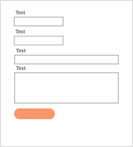
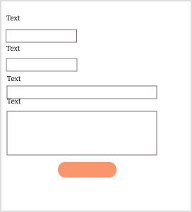
White space helps your website to breathe and look less cluttered. It contributed a lot to the overall harmony of any design. Mind the white space between the different element and their placement on a website page. Avoid placing elements very close to one another, or very close to the borders of the page. It makes some elements or text look crushed.
Mind also a space between lines in your text. Space makes the text easier to read. Also, group elements that belong together. It will help to eliminate confusion among your prospects. Our brain treats information in a certain way. If you want to learn more about the law of proximity, and the way you should group elements on web pages, check this article.
Can you see any difference? Does one form is better than another?
Conclusition
Good design doesn’t look this way accidentally. It’s a result of conscious decisions. When the design is good, usually we don’t notice. We just go through the website and enjoy our experience. It’s a good sign!
But when we get confused by colours, and cannot find the information we need, we get frustrated and leave. There’s no magical formula that will create an ideal website for your business. Although there are some simple and verified design principles that you can follow to improve your website and make it look professional and beautiful. Learn about why the design looks good.
Consistent style. Create a brand guide or brand board to stay consistent throughout your website design.
Align text and all design elements properly on every single page of your website.
Pay attention to white spacing and proximity
