🇺🇦 I stand with my family, friends, colleagues in Ukraine, and all people of Ukraine. To support Ukraine visit this page.

FacebookXPinterestLinkedIn

How to design a perfect cover for your home page

It can be a nightmare sometimes to create and design a proper cover for the home page of your website. It’s always very difficult to choose the design, especially when you’re not a professional web or graphic designer. But you still want your website to look beautiful and be cohesive. In addition to beautiful design, your home page cover should be strategic, and clear, and fulfill a very specific goal.

I struggled with creating a good cover for my home page for a very long time. I searched for inspiration but still couldn’t figure out what kind of design I would like to use and what will work the best for my business. In the very beginning, as I knew nothing about web design, my first website looked very chaotic and was not intentional.

What roles should a cover of your home page play?

Creating an aesthetically pleasing design is important, but the most important role of your website isn’t being beautiful. The main role of your website is to attract the right people, build connections, and make your prospects take action when they land on your website. 

Your cover, as any other section on your website pages,  should play several very important roles.

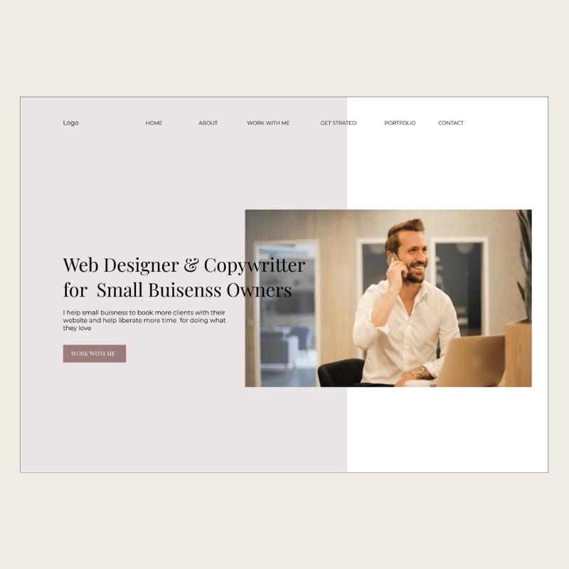
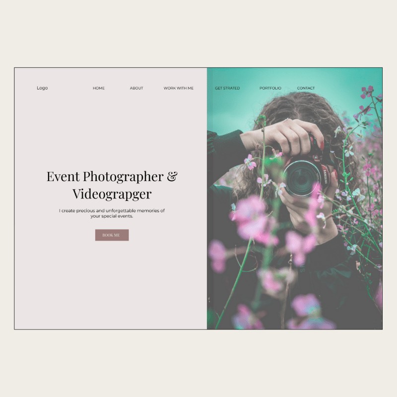
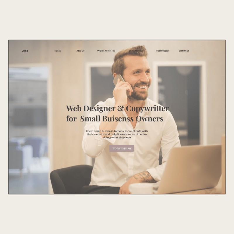
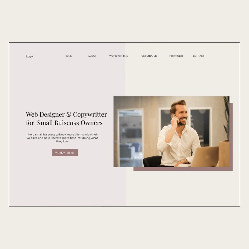
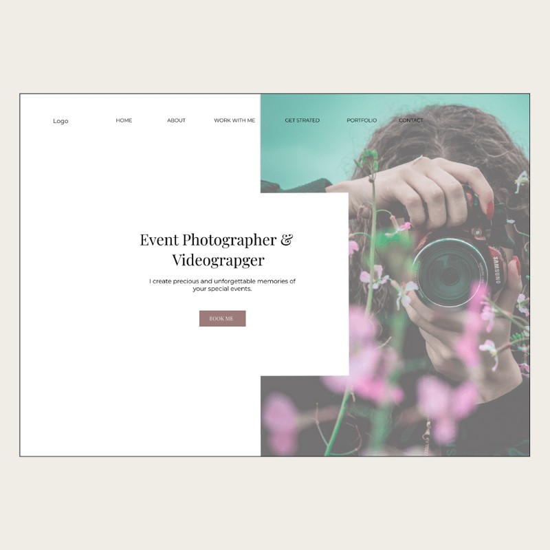
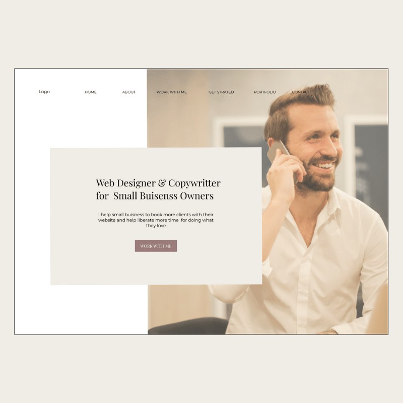
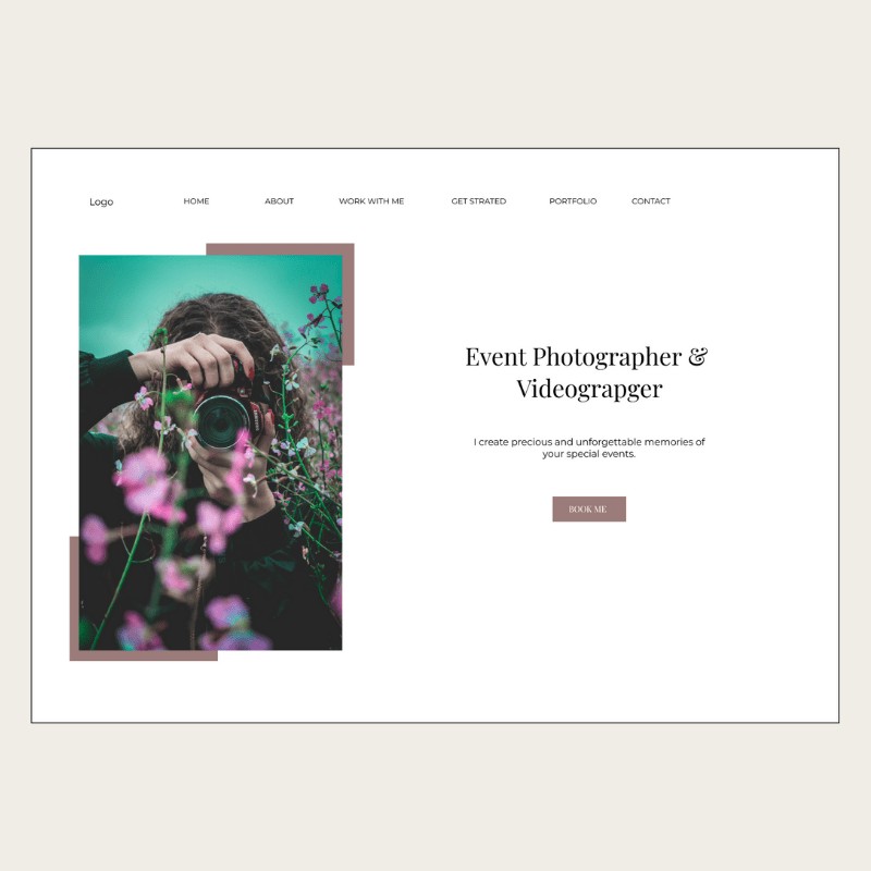
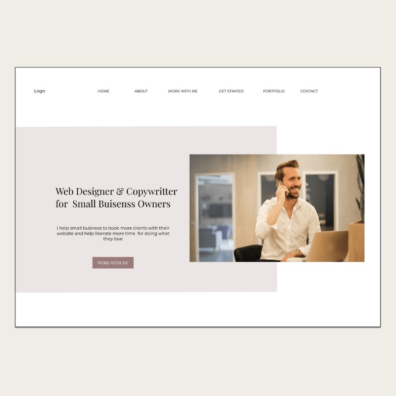
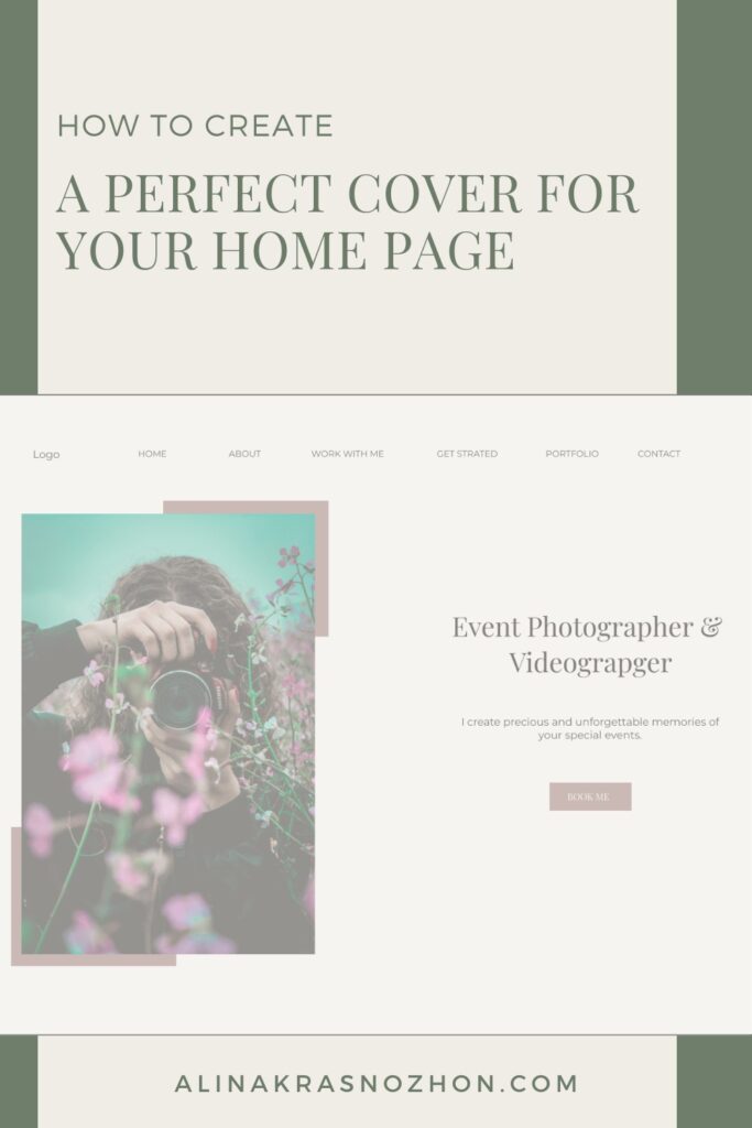
The cover of your home page is the first thing your prospects see when they land on your website! You don’t want them to see a messy and huge chunk of text that is hard to read, stock photos of smiling people, and absence of calls to action.

These are some of the best practices for the cover of your home page:

▶️ Have a clear and visible navigation menu.

▶️ Your logo should be placed on the top of the page. It’s where your prospects expect it to be.

▶️ A high-quality photo of you. Please don’t use stock pictures of smiling people on your home page cover! People want to connect to REAL people.

▶️ A clear statement of what you do and how you can help your prospects.

▶️ Call to action.

Clear and well-placed navigation menu

People don’t have time, don’t make them think too hard and figure everything out when they land on your home page. Most likely if they cannot find what they’re looking for, they will just leave.

Your navigation menu should be visible from every page of your website. Visitors should be able to navigate to the most important pages easily and without clicking 10 times and search how they can do that. People lose attention on the web very quickly.

Don’t place your navigation menu in a weird, unexpected place or make it look like not a navigation menu or what’s even worse hide it.

The best is to have the navigation bar when your visitors expect it to be – on the top of your website. As long as it’s on the top and visible, you can place it more to the left or more in the middle. It’s up to you to choose.

Make sure your Logo is visible and well-placed

Make sure that your logo is visible no matter on what page your visitors land. It can help to build some brand awareness.

Don’t place your logo in weird and unexpected places as well. Make everything easier for your visitors and put it where they expect to find it. The best practice is to have it in your navigation bar either on the left or in the middle.

High-quality photos of you

This one is huge! Make sure that you have beautiful, high-quality photos of yourself to put on your website. Don’t use excuses, hide, and put some random stock photos of smiling people all over your website. People want to see REAL people behind their brand and business. The era of the faceless corporation is in the past. Even a lot of very giant corporations start to invite and use real people to seem more human.

There were many studies conducted on how users treat images on the web. Stock, generic photos in most of the cases are ignored completely by visitors. But photos of real people is treated as a valuable piece of the content. If you do still not have doubts and don’t want to use photos of yourself, check this study concerning photos as web content published on one of the world biggest websites dedicated to user experience on the web.

Don’t worry if you cannot afford a photographer, you can always make great and high-quality photos for your website by yourself.

A clear statement of what you do and how you can help

This section is as important as high-quality pictures of you. When your prospects land on your home page, they’re looking for a particular solution for their problem, and they want to know right away whether you’re the right fit for them.

When it’s not clear from first sight what you do and how you can help, most likely your new visitors will leave. You can make a quick test by yourself. Ask people to go to your home page, and see if in 3 to 5 seconds they can say what your business is about, and how you can help make their life better or solve a particular problem. If they need more than 5 seconds to tell that, most likely you need to make some improvements.

If you have no idea where to start, there’s a very simple formula you can use to help you: (What I am). I (do what) (for whom) (with what benefit).  It shouldn’t be the exact formula, but it’s just to give you an idea.

Call to action

Your website should have a nice and consistent design, but most importantly it should make people take action. You don’t want your visitors to browse your website and leave.

Often, people even want to take action, want to be told where to go next and what to do, but they can’t do that, because there are not enough call to action on a website.

Make sure that you have a clear call to action on your home page cover. What are you want your visitors to do? To work with you? To book a free call? To subscribe to your newsletter?

The best rule to follow is making sure that every single of your web pages has at least several calls to action.

Home page cover design inspiration

When I built my first website, I had really hard times creating beautiful cover designs for my website pages. I prepared some possible variations you can use if you decide to build a website by yourself. I used examples of a web designer and a photographer.

FacebookXPinterestLinkedIn