🇺🇦 I stand with my family, friends, colleagues in Ukraine, and all people of Ukraine. To support Ukraine visit this page.
how to create a perfect about me page for your small business + template
The about me page is one of the most overlooked pages of a website, however, it’s second the most visited page of any website after your Homepage. When you just starting out, probably creating an About Me page won’t be your priority. You will more likely focus on your home page, service and contact page. And you don’t need to have everything ready, all pages have been perfectly done before you launch your business. You can always add more pages with time.
Usually, we keep putting away creating our about page, as we don’t like to speak about ourselves, and sound egocentric ( well, maybe some people do like it, but not everybody). But your about page isn’t about you, and never actually was. It should be mostly about your ideal client.
Your about page isn’t there to talk about your passion, to present every single date of your biography and your background, or show people all your diplomas, and awards you have.
The purpose of your about page is to reassure potential clients that you’re the right choice, that you’re an expert and that you can be trusted.
There are several reasons why your website visitors might want to find an about me page on your small business website.
Why do people click on the about me page
When your website visitors click on your about page usually they would like:
- They would like to find out if this business, brand or person is legit. Does this person have experience and any background in what she does? Did she work with recognized people or brands in the industry? Does she have the expertise and skills to complete the project I will hire her to do? Are any unbiased case studies, or testimonials that can prove it?
- They don’t quite yet understand what your brand and business are all about and they would like to know more. If it’s a case it means you somehow failed to communicate in a clear way what you, your brand and your business are all about on your home page. If this is the case, it might be a good idea to improve your home page.
- They would like to know if they resonate with this brand or business, with its mission, values, purpose, and why. Does this person care about the things I care about? Do we have similar values? Do her purpose and mission excite me?
Why do most about me pages fail?
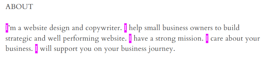
Your copy is too self-centred.
People are interested mostly in themselves and in solving their problems, they don’t want to spend a lot of time reading about you and your achievements. They only care about what is there for them and what you can do for them to make their lives easier or solve their problems.
If you’re not quite sure how you can improve your copy, a very simple tip is to stop using pronouns like WE, and I and shift your focus to the person who is reading your copy by addressing them and using pronouns like YOU/YOUR.
There is a simple technique to find these pronounced on your website copy so that you could change them after. Click Ctrl+F and type the world you would like to find. Here is an example of a very nad self-centred copy example:
You don’t have photos of real people and use stock photos instead.
Usually, it’s quite obvious when you use stock photos of smiling people, you don’t know on your website. People ignore stock photos, they don’t add anything useful to your website but just take space.
Using photos you took, and photos of you and your team it’s your possibility to connect with your website visitors, to tell a story, to let them find out more about you and show your personality, and make them trust you.
Mind your tone of voice and the vocabulary you use in your copy.
Don’t just write generic stuff that you think your prospects might want to read. Don’t use smart words that add zero value to your website visitors. Don’t try to appeal and speak to everybody. Appealing to everybody means appealing to nobody.
Instead infuse your personality into your copy, express your opinion, and share your experience. Use simple and understandable vocabulary to describe your client’s problems, and current situation, and describe how you can help them. Show them that you understand them and genuinely care.
No social and credibility proof.
It’s important to include social proof on your about page the same way you would do on any other page. Let other people, your former clients, and your case study tell and show how great you are, instead of singing odes about yourself by yourself.
Mind simple design principles.
I will not be talking here about the aesthetic aspect of design, but mostly about the user experience aspect. When things are hard to understand, hard to find, or hard to read, when something annoys people, they will leave your website, and most likely won’t come back. Here are several things that ruin your website’s user experience a lot:
- Walls of text and insufficient use of white space
- Busy and cluttered interfaces
- Poor choice of font size, colour, and contrast, which makes text very hard to read.
- Aggressive sales tactics, annoying pop-ups, and banners that are appearing and moving by themselves.
No call to action.
Just like every page on your website, your About page should conclude with a call to action (CTA).
Don’t leave your website visitors guessing what they need to do after they finish reading your page. Guide them, and invite them to take action. It can be something like booking a call, contacting me, joining my email list, checking my blog post and do on.
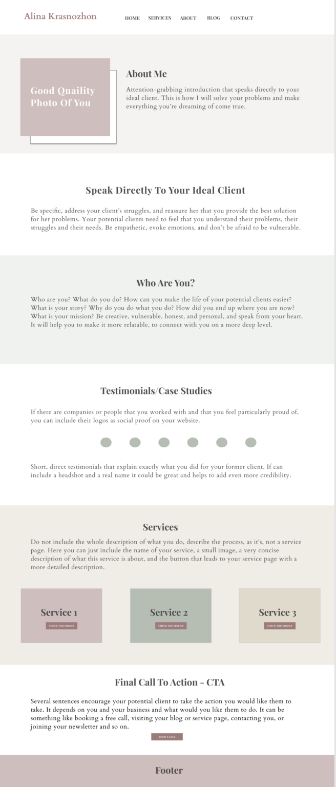
A template of the about me page that you can use to build a great about page
Final thoughts
In a world of too much noise, people are very sceptical and value authenticity and transparency more than ever. They don’t want to deal with complex terms, hard-to-understand jargon, or stock photography. People favour small businesses and companies that showcase themselves as being customer-focused, human, and easy to understand.
People value plain, easy-to-understand language whether it’s your website copy, your blog posts, or an email. They appreciate copy that makes them feel as though they are having an intentional and mutually beneficial conversation with a human. They appreciate it when they see real photos of people and products when they can easily find all the necessary information without spending all their mental energy doing that.
They appreciate when the page is clear and when in several seconds they can understand what your business and brand are all about. They would like to find out fast how you can solve their problems, and if you’re the right choice for them.
You can totally speak about yourself on your About Me page, but don’t forget to always have in mind your ideal client who is reading your copy. Shift the attention from you to her, even when you speak about yourself. Let them know that you understand them, value them, and that you’re open and ready to genuinely connect to them.
Here is an article from the biggest user experience research website that you can check to learn in more depth about how to improve your about me page:
https://www.nngroup.com/articles/about-us-information-on-websites/