🇺🇦 I stand with my family, friends, colleagues in Ukraine, and all people of Ukraine. To support Ukraine visit this page.
10 design principles to elevate your small business website
Design isn’t a precise science. Different people will react, interact, and behave differently on your website. It’s almost impossible to be 100% sure what users will do on your website, and that they will find it aesthetically pleasing. In my old blog post, I already touched on the topic of simple principles to make your website look more professional even if you’re not a website designer.
However, there are still some simple design principles that were investigated, created, and tested by thought leaders in the website design industry, psychologists, behavioural scientists, and other professionals.
By implementing these simple rules you can make your website more clear, more user-friendly and more aesthetically pleasing. Your small biz website will look more professional and will create a better overall impression among your prospects.
At the end of the day, you don’t spend your time and money on creating a website for your business just for the sake of it, just to look at beautiful pictures and graphics. Most likely you would like your website to do something for your small business. Whether it’s getting more visibility, establishing expertise, booking more clients, getting more email subscribers, making people contact you or booking a call with you.
So what actually creates a good website design?
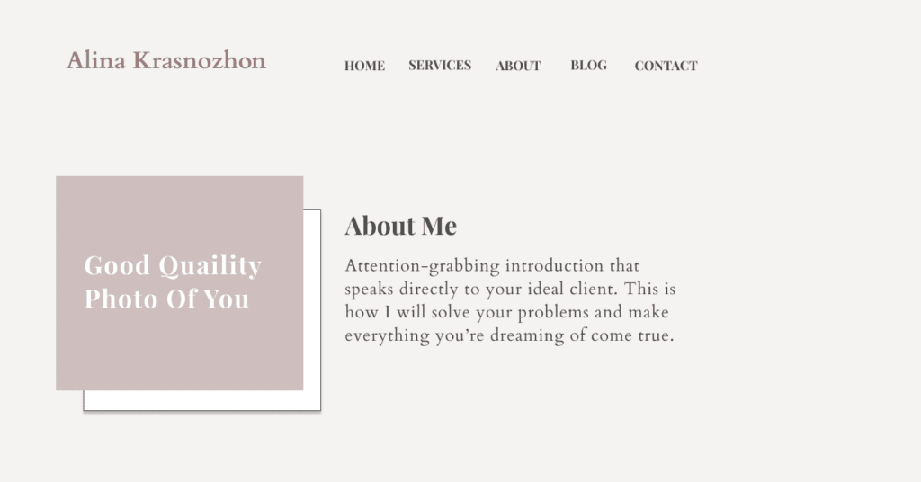
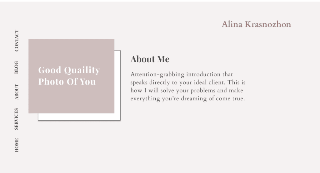
Clear and seamless navigation menu
I crossed so many beautifully designed websites, but the navigation was horrible. I couldn’t understand how to navigate the website, and where to click to find the page I needed. It’s frustrating, and I don’t have time to figure out how to navigate the website, so I leave.
Your website users expect to find a navigation horizontal navigation menu, not on the left, not on the right, not a hamburger menu (except if it’s a mobile version), and not in the middle of the page. You want to make sure that your navigation menu is simple, predictable, and intuitive. Don’t make people burn thousands of calories searching and figuring out how to use your navigation menu, because most likely they won’t do that, they have better things to do with their time.
A standard navigation menu will make your website easier to use. It means a lower bounce rate, more pages per visit and higher conversions for your small biz website.
Here are two examples of menus: the first one is a good one and the second one is quite weird and confusing.
Overall consistency
When I design my first DIY website I knew nothing about consistency. Probably that’s why my first website looked pretty bad, but well, it was still a valuable learning experience that trained my skills a lot.
Consistent design and usability make your website whole. It improves your website’s usability. When your website visitors learn how to use one part of your website, they can easily apply this knowledge to using another part of the website. They won’t need to spend a lot of time figuring out how to use every single element and page of your website over and over again. You want to make your website as simple to use as possible.
Consistency includes everything starting from consistence use of colours, fonts, buttons, style of forms, placement of icons, spacing, photo style, and navigation. When you create a website for your small biz you might want to keep in mind several types of consistency:
- Visual consistency – the way your website looks which includes consistent use of colours, fonts, photos, and other design elements like forms, buttons, boxes and columns.
- Content consistency – your voice, the quality of your content, and brand messaging are the same all over the website
- Functional consistency – the same elements like buttons, link, forms, and any other types of animation always works and looks the same way.
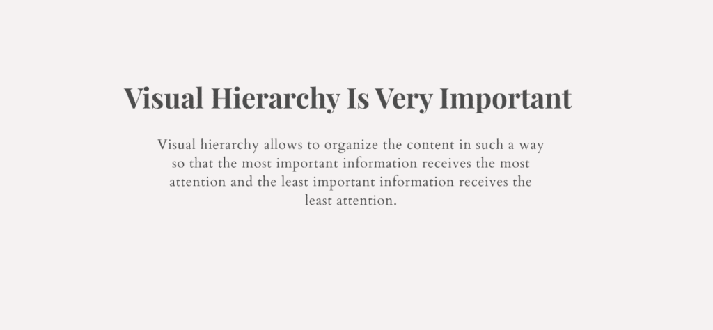
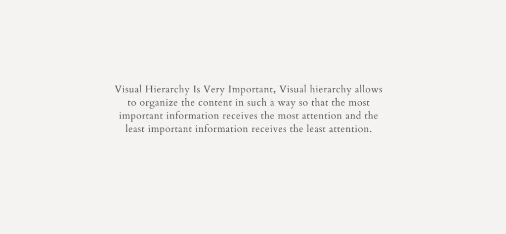
Visual Hierarchy
The information on your website should be well-organized and easy to digest. Visual hierarchy allows the organisation of the content in such a way that the most important information receives the most attention and the least important information receives the least attention.
Visual hierarchy can be implemented through variations in size, value, colour, spacing, placement, white space, alignment, and movement of different elements on your website. Wise implementation of the hierarchy principle will help you to guide your website visitors through the website and make the content easier to understand and navigate.
You can try to do a small test on your website and see if something grabs your attention right away. If you feel lost, and can’t figure out where to look first, most likely your website’s visual hierarchy needs some improvements.
The most common way you can do that is by using different sizes of fonts, and brighter colours for the elements you would to emphasize.
Balance
Balance is important in everything including your website design. Our brain favours balance. When content and design are uncategorized and chaotic, it’s confusing and hard for our brain to make sense of it, so it creates tension. If your website visitors feel this way while browsing your website, it will inevitably leave to lower conversion and a higher bounce rate.
Balance occurs when all the design elements such as colours, white space, icons, and textures, are well organized on the page. When it happens it creates a balanced composition. When your design is balanced and there is no particular element that attracts more attention than any other.
When you create your website, a simple rule of thumb will be to really pay close attention to how you distribute elements on the page. Make sure the elements are not too close to the edges of the web page, and that there is a proper alignment. And that you intentionally use balance whether it’s symmetrical or asymmetrical while keeping in mind your website user and the tasks she would like to accomplish on your website.
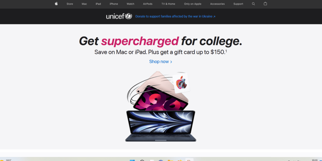
Simplicity is key
All decisions making demands a lot of mental effort. Have you ever noticed how exciting it can be to have a huge menu in a restaurant at first? As exciting as it might seem in the beginning, the more time you spend choosing what you would like to eat the more tired and irritated you feel. You feel lost, the pressure goes up, and you just can’t make your mind up.
We have limited capacities for processing information as human beings. Often we choose the path of least effort and least resistance to just protecting ourselves from information overload and fatigue. Our brain is lazy, it doesn’t want to burn too many calories making decisions.
You don’t want to make your website too overloaded with unnecessary information, complex and unclear design, animated elements and pop-ups that are moving by themselves. It’s more likely that the user will get lost, overwhelmed with unnecessary information and make the wrong choice or just leave. Keep everything clean and simple. Numerous studies have shown that people actually prefer simple websites.
You can get inspired by big companies’ websites. They have a huge team of researchers and web designers that can create the best-performing websites. Among such websites is Apple’s website. It’s simple, one call to action, users know exactly what to do when they land on their home page: SHOP NOW.
typography and readability
Choosing the right font types and sticking to them can be a challenge. Especially when you didn’t do profound branding and self-discovery work before choosing your visual brand identity. You don’t need a lot of fonts for your website 2, or 3 fonts are more than enough. One for headings, and subheadings, the second for the text and the third if you would like to use a script. You don’t want to overwhelm your website visitors by using 10 different fonts.
You want to actually make sure that people can see, recognize and read the content on your website. It’s a quite common mistake I see people make on their DIY websites. There are several main tips that can improve the readability of the content on your website.
- Make sure that your font size is neither too huge nor tiny. Use a font size large enough so that people could actually read it.
- Make sure that links look like links, and that people can actually see that it’s clickable
- Use small sections of text instead of a huge wall of text.
- Use high contrast between the text and the background. Choose simple background over a very busy textured one.
- Use short sentences
- Don’t put your text close to the edges, it forces the eyes of your users to move too much, cuts the text, and looks not nice.
- Use extra space between lines of text
- Say the most important information in the first two paragraphs. Very few people will read your whole copy. People scan information on the internet but do not read it. On the average web page visit, users read only 28% of the words.
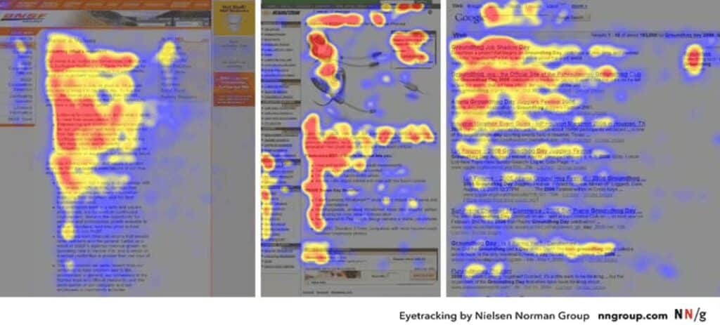
- “F” Pattern design – web users scan computer screens in an “F” pattern. They read from left to right, and from the top to bottom. You can adapt your copy for easy eye scanning. Down below I insert the image from the biggest user experience research website when they tracked the eye movement of website users.
Embrace White Space
White space is as important as any other design element you use on your website. It is empty space around the content and functional elements of a page. It’s also called negative space. Don’t be afraid to use white space, it’s not a waste of space. Negative space makes your website look less cluttered, and more user-friendly, with balanced design elements and better-organised content.
You don’t need to clutter every small piece of white space on your website with a photo, graphic element, and annoying animation. Don’t forget that your website has a goal, you didn’t create it to show your amazing design skills or beautiful pictures.
Use white space strategically to create a coherent and harmonious look for your website. It will make your website ”breathe” and will make information and content on your website easier to perceive, navigate, and digest your website users.
Responsive design
Adapting your website to a mobile device is vital these days. By 2020 mobile devices drove 68% of global website visits VS only 29% of visits on a desktop and this number keeps growing every single day.
You might want to make sure that your website looks great on every device, and that your website users have the best user experience while interacting with your website. Sometimes the design can look a little bit different when you adapt it to the mobile device and it’s totally okay! It’s impossible to make your website look exactly the same as on a desktop. There are several key elements you should focus on:
- layout – does it look good on a mobile? Is the text not too close to the edges? Do you have enough white space between the elements? Does the navigation menu look good and is it clear that it’s a navigation menu?
- Images – do they properly sized? Did the images you choose for the desktop design look good on the mobile, and if not, what other images can you use instead?
- Typography – Is there a proper hierarchy? Is the size of fonts, headings and subheadings adapted to mobile devices?
Divide Content into Small Chunks
Breaking down the content on your website into small chunks helps your website users to process, remember and understand the information better. As I mentioned before people scan information on the web, but rarely do they read everything in detail. And you want to make sure that you make content on your website as easy to scan as possible. People appreciate it! As reading walls of text can be very tiring, time-consuming and intimidating.
There are several simple techniques that can help you to chunk the information on your website quite easy:
- Short paragraphs
- Shorter sentences
- Bullet points or number lists
- Clear visual hierarchies with related items grouped together
- Highlighted keywords (bold, italic, etc.)
- Headings and subheadings that clearly contrast with the rest of the text (bolder, larger, etc.)
- A short summary paragraph for longer sections of text, such as articles
Images
Images can tell more than 1000 words, they can evoke emotions, enhance your brand, and connect to your target audience. A strong visual system builds user trust and interest in the product or services you offer. It appropriately represents and reinforces your personal brand.
Do the images you have on your website are high quality? Do you have high-quality shots of you and your team? Do you use images that actually help you elevate your brand and tell the story?
Don’t worry if you can’t hire a professional photographer just yet, you can totally make high-quality photos for your website by yourself. Do the stock photos you chose correspond to your brand and enhance it? Or do you have some random photos of smiling people and computers?
A good balance and mixture of carefully chosen, edited stock photos and high-quality photos of you can make wonders for your small business website and your brand.
Final thoughts
Making your small business website visually appealing will help to enhance your personal brand, grow your business, attract more people, and connect and build trust with your target audience. It will make it user-friendly which will make your website users spend more time on your website and navigate it more easily.
Beautiful things evoke positive emotions and delight. In fact, when people find a design visually appealing, they may be more forgiving of minor usability defects – aesthetic–usability.
You don’t need to be a professional website designer to improve your small business website. You can do it easily by yourself by implementing the simple design principles I mentioned above!